Showing posts with label reviews. Show all posts

17 April 2008

Shame on you APC magazine! (Plasma & LCD wars)


Something odd is afoot in the world of large format televisions. There seems to be a global attempt move by the media and sales outlets to trumpet the cause of LCDs at the expense of plasma. Never mind the fact that a blind man in a snowstorm can tell that plasma is better at almost everything. Never mind the fact that large LCDs are still more expensive than comparably sized plasmas.

So walk into a major retail outlet and look at how the floor is set up to drive you towards the LCDs. Look at the way the screens are calibrated to minimise the differences between the two, and the store lighting is set to flatter LCDs. Notice the reluctance of shop staff to tell you flat out that plasmas are still generally better at motion, colour, blacks and that resolution is not ultimately important compared to what you see with your eyes.

Look at the media's constant prattling on about LCD 'closing the gap' and becoming the equal of plasma in so many areas. Then think how many years they've been giving us that message. The media is now speculating that Pioneer's recent decision to stop making plasma panels is a sign of their resignation to the victory of LCD in the long run. Nonsense. Although Pioneer has long since made the world's best plasma panels they just can't make them at a realistic cost, and they realise it. Their chief competitor, Panasonic, works to very different economies of scale and has significantly closed the quality gap such that Pioneer screens are simply not competing in the market. Only sensible then, that Pioneer source their screens from Panasonic in return for sharing their technology. It has nothing to do with Pioneer changing its mind about the superiority of plasma in large screens.

So where does Australia's erstwhile APC magazine come into it? Well, this publication, for whom I have always had the utmost respect, has a headline this month which loudly announces "LCDs CATCH PLASMAS" and "SHOCK RESULTS" implying that the LCD panels on test match the plasmas. The trouble is, that is simply not the conclusion of the tests inside the mag. The article in question evaluates 2 plasma and 3 LCD panels and the plasmas come first and second, closely followed by a Sony LCD with the other LCD a distant 4th and 5th. And anyone who has been shopping recently knows that Sony LCDs still cost significantly more than equivalent sized Panasonic plasmas, for example.

So, APC editors, a far more honest cover headline would have been "LCDs STILL TRAIL PLASMAS". Why did you chose to run the misleading one, and are you too part of the global conspiracy against plasma screens?Go to eebahgum!

29 September 2007

Australia's 'Are You Smarter Than a 5th Grader' reviewed


Australian television has recently hit a new low with the first airing of the Oz version of Are You Smarter Than a 5th Grader. That the show lacks any form of originality can be seen merely from the title—in Australia, the terms ‘Grade 5’ or ‘Year 5’ are used, rather than the American ‘5th Grader’. Channel 10 is obviously low on talent, so they have stuck Rove McManus into the hosts chair, a man hailed by more eloquent critics than I as “the least funny comedian in Australia’. Indeed, Rove is true to form—he talks a lot and only manages to raise a smile on his own face.

As for the show itself, it’s inane, clichéd nonsense of the highest order. The premise of the title is stupid, as obviously the comparison alluded to is not one of intelligence but knowledge. Even then, the premise turns out to be false, because there is no competition between the Year 5 students and the adult competitors. Rather, the kids are there to assist the adults in winning money—they’re all on the same team.

The questions are ridiculously drawn out, in the style of Who Wants to be a Millionaire, and Rove insists upon borrowing from that show’s host, Eddie McGuire, by constantly describing the simple act of answering a simple question as “locking in your answer”. A piece of advice, Rove—if you are the least funny host on Oz TV, Eddie is no funnier, and a whole lot less likable, so perhaps he’s not the best person to be emulating.

The first episode only managed to maintain a semblance of entertainment by virtue of its supporting cast. The kids were generally bright, chirpy, enthusiastic and likable, and the first contestant, Elka was a good looking blonde with a range of quirky facial expressions that were passingly entertaining. And although she was forced to look at the camera at the end of her stint and admit “I’m not smarter than a fifth grader”, she didn’t look very depressed by this admission because she’d just won $100,000 for a few minutes easy work. Assuming that the kids didn’t walk away with the same kitty, then who was the smarter?

Australian Quiz shows are generally pretty pathetic affairs, in which half-literate hosts grin their way through stupid questions fired at largely dumb contestants for huge amounts of money. Even long-running classics like Temptation have got dumber over the years. The ABC’s Spicks an Specks is a lone oasis in the wilderness, but where are the truly cerebral programs like the BBC’s exceptional QI, or the old ABC classic Mastermind, which actually celebrated the intelligence and knowledge of intelligent, knowledgeable people?

Today’s quiz shows on Australian commercial TV are clearly aimed at making couch potatoes at home feel smarter. This one will do that, and may even boost the ego of the family dog, cat or goldfish.
Go to eebahgum!

1 September 2007


If you wanted to play critic, there’d be a lot you could criticise about The Bourne Ultimatum. There’s not really that much story that we weren’t privy to before; several situations are borrowed from the second film, which, coupled with the obligatory and always annoying flashbacks may be a good hook for first-time viewers but falls flat for fans; Bourne repeatedly walks into situations of peril that he could just as easily have walked away from; neither dialogue nor performances will grip you; and there’s still that lingering doubt about that ‘nice young man’ Matt Damon playing a tough guy assassin.

But action flicks are ultimately about suspending disbelief. The most successful of them encourage us into just the right amount of suspension. Too little and we’ll be picking the film to bits before the opening titles have faded. Too much and we’ll have forgotten the experience before the closing credits.

Judging by the looks on the faces of those who watched it with me, The Bourne Ultimatum gets it just right. As the last scene faded no-one was dissecting the plot. Instead they were recovering their breath, laughing in that particular way that indicates a mix of cheer and release, or just forming their lips into the shape “Wow!”

Because when all is said and done, The Bourne Ultimatum is a roller-coaster ride into absurdism, which manages to also keep some hold on reality, or at least that variant of reality that occupies the continuum between our fantasies and paranoias. It’s a frenzy of hand-held camerawork and tight, choppy editing which occasionally pauses long enough so that you can hear the pounding in your temples, before careering headlong into the next sequence. Along the way, we are treated to some scenes that will doubtless become cinematic classics—perhaps the most exciting car chase sequence ever (move over Ronin), and the absolutely gripping early scene in Waterloo Station.

This was undoubtedly the most exciting two hours I have ever spent in a movie theatre, which makes any form of quibbling rather pointless. Instead, I’ll just join my “Wow” along with the others and urge you to see The Bourne Ultimatum. Firstly because it’s fun, and secondly because every future film in the genre will in some way be measured against it.
Go to eebahgum!

14 August 2007

The Maltese Falcon revisited


Yesterday I had the pleasure of taking my son to see The Maltese Falcon on the big screen. I have seen the film at least 4 times before , but was still bristling with excitement beforehand, tinged with just a little trepidation as to how he would cope with ‘film noir’ at the tender age of 10. I’d prepared him by emphasising that it was a dialogue-driven, rather than CGI-driven film, and that it was not in colour. “What, none of it is in colour?” has asked at one point. Er, no, absolutely none. It is film noir et blanc, or at least, various shades of gris, in presentation if not in content.


Although it was late and he was weary, I am glad to report that he liked the film, giving it “less than 4 stars but more than 3 and a half”. On that basis, I think he preferred it to Shrek 3, which we are agreed was pretty awful, with untold money being spent on CGI where a decent writer may have been more useful, but less than Spiderman 3. I guess, in the balance, that should be considered a victory.

I, on the other hand, had expected to be underwhelmed by a film with which I was already so familiar. Instead, I was completely wrapped in every moment of it on the larger screen, drawn into Bogart’s every sneer and smirk, irked by Peter Lorre’s sinister simpering, beguiled by Sydney Greenstreet’s deep, yet threatening reasonableness, and almost seduced by Mary Astor’s beguiling dishonesty. Characters complex, yet without depth, each one almost psychopathic in his or her lack of emotion and sympathy. And with a sympathetic audience around me, the sheer brilliance of the writing seemed compounded. Even out of context the many of the lines seem magical:

BRIGID O’SHAUGHNESSY (MARY ASTOR): He has a wife and three children in England.
SAM SPADE (HUMPHREY BOGART): They usually do, though not always in England.

SAM SPADE: We didn’t exactly believe your story, Miss O’Shaughnessy. We believed your two hundred dollars.
BRIGID O’SHAUGHNESSY: You mean that—
SAM SPADE: I mean, you paid us more than if you’d been telling us the truth, and enough more to make it all right.

SAM SPADE: When you’re slapped, you’ll take it and like it!

KASPER GUTMAN (SYDNEY GREENSTREET): I distrust a close-mouthed man. He generally picks the wrong time to talk and says the wrong things. Talking’s something you can’t do judiciously, unless you keep in practice. Now, sir, we’ll talk if you like. I’ll tell you right out, I’m a man who likes talking to a man who likes to talk.

KASPER GUTMAN: I distrust a man who says “when”. If he’s got to be careful not to drink too much, it’s because he’s not to be trusted when he does.

KASPER GUTMAN: Well, Wilmer, I’m sorry indeed to lose you, but I want you to know I couldn’t be fonder of you if you were my own son. Well, if you lose a son, it’s possible to get another. There’s only one Maltese Falcon.

SAM SPADE: Yes, angel, I’m going to send you over. But chances are, you’ll get off with life. That means, if you’re a good girl, you’ll be out in twenty years. I’ll be waiting for you. If they hang you, I’ll always remember you.

SAM SPADE: All we’ve got is that maybe you love me and maybe I love you.
BRIGID O’SHAUGHNESSY: You know whether you love me or not.
SAM SPADE: Maybe I do. I’ll have some rotten nights after I’ve sent you over, but that’ll pass.

I looked up Falcon in my Halliwell’s when back home, and found it had 3 Academy Award nominations in 1941, but no wins. Then I remembered that another one of my favourites was released in the same year, Citizen Kane, one of the handful of films which could legitimately lay claim to being the greatest film ever. What bad luck for Falcon, I thought, then discovered that the film that had cleaned up at the 1941 Oscars was, in fact, the now very dated-looking How Green was my Valley.

But The Maltese Falcon has not dated, only matured. And as Hollywood has moved from silent film, to talkies, and somehow back again to a new age of pseudo-silent film through CGI-driven blockbusters which no longer exalt acting or screenwriting, the black bird seems to have been given new wings.
Go to eebahgum!

17 July 2007

Bargain fountain pen from Charles Hubert, Paris

I've always been a lover of fountain pens, and seem to take greater pride and care in what I write when holding one. Of course, it sometimes bumps into the keyboard when I'm typing, but that's the price I pay. Bad jokes aside (they'll be back later, I'm sure), my increasing computer use over a decade has tended to mean I write less with my hand, and my handwriting tends to reflect. But very few things match the feeling of writing on good paper with a substantial fountain pen. Over the years I've had (and lost) several Parkers and Lamys, and a lovely silver Shaeffer with inlaid gold nib (the best pen I've ever written with—I hope the person who pinched it from the Adelaide Uni games room in the mid 90s has made good use of it).

My current FP is a magnificent titanium-barrelled Cross Townsend, with the top of the line gold Extra Fine point. It's long and weighty, with a mirror-like finish that demands constant polishing. With that XF nib, it's not the smoothest writer ever, and it also tends to leak just a little. But it is a thing of elegance and beauty, which, because of my predilection for losing pens, has only left the house once in the dozen years I've owned it.

Not the most useful day-to-day pen, then. That tasks falls to a stylish red lacquer Parker Sonnet II ball pen (my second, of course) which I like very much, but I've been in a nib and ink mood recently, which has sent me to the web looking for FPs once again.

Following in the tradition of great pens such as Parker and Waterman, which hail from France, I came across a good looking fountain pen on eBay the other day called Charles Hubert, Paris. At the price it was clear that we weren't talking Paris, France, but Paris, China, but in the seller pictures as well as those at isellpens.com the entire range looked very well made. So I spent my $40 Australian plus P&P and acquired this little beastie, its finish reminiscent of the Sterling Silver Parkers, only in turned stainless steel:


It looks pretty well-finished in the pictures, doesn't it? That's because it is. Everything lines up nicely, the chroming is excellent and the cap clicks on and off very nicely at both ends. Clips are often a tell-tale sign of cost cutting, but even this is stylish and neatly finished. The nib, labelled 'Iridium Point Germany' looks good quality, and whilst its thickness is not labelled, I'd call it a Medium point towards the narrower end of that continuum.

In the hand it feels very solid, although the centre of gravity is a little high up the shaft for my liking with cap unposted, more than 8 cm away from the nib out of a barrel length of 12 cm. By contrast, my slightly longer Cross has a lower centre, and therefore just seems to take a fraction less effort to direct across the page. But I'm splitting hairs here, even if the price differential (which is almost ten-fold) were not taken into account. When I first picked up the pen, the black part of the barrel also seemed a little short, so that my fingers were riding up onto the fatter stainless steel section. This was a little uncomfortable, but I've quickly become used to it.

The nib is reasonably stiff and still a little scratchy having only been used for a week, but with the standard un-marked ink cartridge that came with it, it's a nice writer, with good, even inkflow and solid colour. When I get a higher quality cartridge in it things can only improve. And so far there has been no leakage or ink build-up on nib, finger-wrest or inside the cap, a problem which has always quietly afflicted my Cross.

Overall, the pen oozes quality, is fun to write with and I can afford to take it out of the house. At the price it is an absolute bargain, and I suspect the same could be said of others in the range, which I will explore further. Highly recommended!

You can source these pens from my Australian eBay seller, Selectview, who offers good prices and service or at www.isellpens.com.
Go to eebahgum!

28 April 2006

Review: Apple USB keyboards

I must admit, I am a bit of a keyboard tragic. I have spent countless hours of my life testing keyboard after keyboard searching in vain for the perfect action. And frankly, I am appalled at most modern keyboards, with their soft, squidgy, imprecise keys.

To my mind, the best keyboards ever made were the old IBM ones which had a lovely tactile 'click' at precisely the point the letter appeared. You had absolute certainty about what you were typing, with audible and tactile feedback. The result? More accurate typing with less fatigue. When they were discontinued I spent my spare time scouring garage sales for second hand ones, with some success.

Alas, there are no keyboards on the market which are that good any more, and others I know share this sentiment. Why is that? Have modern keyboard manufacturers lost touch with what makes a good keyboard, or is the pursuit of low cost and high margin compromising quality?

Never fear. Apple has the answer. In fact, they have two answers, in their wireless and wired USB keyboards, and the good news is that they work with both PCs and Macs, so PC users can also have Apple style.

Make no mistake, these keyboards are pretty. With lovely white keys and compact transparent surround, they are neat, modern and minimalist. But it gets even when you start to type. The action is excellent--soft but decisive. There's enough tactility to be certain of the keystrokes, but very little actual resistance. I sometimes suffer from sore finger joints from typing, but that will be less of a problem now. And like the old IBM 'boards, you can hear these ones, not with that lovely precise IBM click, but a slightly more subdued one, almost as effective. It sounds a little loud when you first start tapping away, but it's a gentle and pleasant when you really start getting into it. It somehow sounds like quality and money :-)

Downsides? Of course, there are some. On the staff machine in the Apple store I could see just how grubby these white keys can get. You'll need to clean them down the track, no question.

Also, these keyboards will not please the 'media' heads who think they need a hundred little silver buttons to control media players, quick launch buttons for every application on their machines, etc. Frankly, I wonder about those sorts of people anyway :-) I used to have a KB like that, but never used any of the other keys, and it took up a vast amount of desk space. Apple have taken away all the keys I don't use and given me back a large chunk of desk. To me, that's a no-brainer.

These 'boards do have keys to raise, lower and mute the volume, and all worked first time on my Acer notebook. You also get a disk eject key, which is, of course, Mac only.

So far all my comments apply equally to Apple's wired and wireless keyboards. Of course there are differences. The wired one has a short cable and two USB ports on the back. It also comes with an extension cable if you need more reach.

The wireless one is Bluetooth, so no cables, but also, unfortunately, no USB ports. Instead it takes batteries and is therefore heavier. It sometimes takes a little while to connect via Bluetooth, and from what I here, you might get really frustrated when batteries start to wear out as strange things happen. But if you know in advance, that shouldn't be too much of an issue. However, the web has plenty of sad Bluetooth stories, so maybe there's a caution in there.

At the end of the day, I think the Apple wired keyboard is better than the wireless. Who really needs wireless on your desk? A short KB cable is hardly a great hardship, and it also gives you two additional USB ports, potentially far less problems, and costs half the money, with no future costs. Either will look cool on your desk.

Go to eebahgum!

31 January 2006

Review: Acer Ferrari 4005 and 8104. Power and style

As with most of my reviews, I am not going to give you a run-down of all the features and specs of the Acer Ferrari 4005 and 8104, as that's all available on Acer's website and any number of reviews on Epinions. Instead, I'm going to cut to the chase and tell you what's good and bad about these machines and why you may or may not want one.

First up, bear in mind that the Ferrari 4005 is an Acer Travelmate 8104 in wolf's clothing. They are the same machine, apart from the fact that the Travelmate has a silver exterior and Intel CPU as against the Ferrari's AMD chip and stunning black and red livery with carbon fibre inlays. In addition, Acer have cranked up the clock speed on the Graphics Processing Unit of the Ferrari a little, so it does have marginally quicker video than the 8104. That would be appealing if you are a game player.

As for the AMD v Intel debate, it's mostly stuff and nonsense. Don't believe anyone who tries to make a very strong argument for one over the other. You'll see very little difference in performance. Also, the argument that 64 bit is better because it's the way of the future is also fairly shallow. Very few of your applications are available in 64-bit now, so even with the Ferrari you'll be using 32-bit Windows and 32-bit apps. When Longhorn comes out to replace Windows XP, which may still be more than a year away, you'll still need to upgrade all your applications at considerable expense, and all your drivers, and by the time everything is stable and available under a 64-bit operating system you may well be looking at 3 years down the track. By that time your machine will be 3.5 years old in its technology and you'll be looking to get a newer, faster machine anyway. So it's a non-issue in my book.

Apart from that the 8104 and 4005 are the same. Same excellent build quality, great screen, shape, weight, features and form factor. Same curved keyboard which you may dislike at first but will get used to. Same tendency to run quite warm and have the cooling fan spinning all the time. Same fairly clunky trackpad, which you probably won't use because a mouse is far better--except for that stylish but skippy bluetooth one which Acer ship with the Ferrari--it's a gimmick, and you'll put it away in frustration. In fact, all bluetooth mice I have used are frustrating at the end of the day.

Their inherent similarities mean that both the Ferrari 4005 and Travelmate are great machines. Fast, good graphics, great screens and plenty of power for the reasonable weight. They don't have CrystalBright type screens with their ironically-named 'anti-reflection coatings', which means they are clearly not as good for watching DVDs, although not bad, and clearly vastly better for using as a computer, which is after all, what they are for. I don't get how anyone would think that a shiny screen is an improvement for working on documents and spreadsheets in the differing lighting conditions under which a laptop is often used.

So what are the differences, and why would you choose one over the other or over competing models from other manufacturers? To the last question first--there are not that many competing models. As far as I can tell, Sony, Asus and Toshiba's models in the same price range are less powerful, IBM's are much more expensive, and Dell's heavier. That leaves the likable HP Compaq nx8220 which has better sound and is slightly smaller, but suffers from very poor screen brightness and uneven backlight in the one I've seen--bad enough to instantly take it out of the running.

So it's Acer v Acer up the final straight. The Ferrari wins on looks and sex appeal, but loses a little on the fact that you pay a premium for that. The Travelmate 8100 series gains on the fact that there are now faster models available (2.26 Gig 8106 for example) but loses again on the slightly slower video clock speed.

So it's pretty even coming up to the finish line, until the Ferrari hits its fatal flaw, one that I have not seen mentioned in any other review (though apologies to anyone who has covered it). The keyboard surround/palm rest of the Ferrari is covered in this lovely looking matte rubber finish. Unfortunately, I found it felt absolutely awful under my palms. My hands didn't move easily over it, rather the slightest bit of dust or dirt on the palm rest felt really gritty and I found myself constantly dusting the wretched thing down. I simply could not have seriously considered living with that.

So in the end it's an easy choice. The 8104 won, as it were, 'hands down'! Then I got the bonus prize. When I opened the box in the shop to check the display (always check for dud pixels and keep checking until you get zero. If the shop doesn't like it, go elsewhere) I found that my 8104 had a different finish to every other one in the shop or that I had seen elsewhere. Instead of the plain-Jane silver lid, this one has a metallic, textured, mesh-looking finish which looks like a silver version of the Ferrari. It's still not as stunning as the Ferrari itself, but far better than the usual finish. I think of it as my Aston Martin!
Go to eebahgum!

7 October 2005

Review: Apple's own iPod killer, the Nano

ipod_nano1Call me a Luddite if you will (okay, okay, stop now) but I never really ‘got’ the Sony Walkman thing. I really love music of every variety (except, of course, country and western), and thoroughly enjoy listening to a very good audio system, so listening to music through scratchy little earbuds with the sounds of the outside world disturbing the rhythm and sanctity didn’t seem all that appealing. Besides, most of the time I actually enjoy interacting with the world outside my head, rather than retreating into the twisted space within.

So Walkmans, Discmans and MiniDisc players came and went, and I remained disinterested. Even the iPod, for all its obvious style, didn’t do much to change my mind. Admittedly, I did take to listening to music on my PDA from time to time, but I wasn’t exactly hooked. I did it simply because I am a gadget freak and I could.

When I added the Orange C500 Smartphone to my gadget arsenal, the first signs of enlightenment quickly followed. At last, here was a device small enough and with good enough battery life to make listening to music on it seem pointful. Besides, it was already with me all the time. Recently I have found myself watching movies and TV programs on it, as well as listening to language learning CDs for my holiday in Barcelona last week.

But the iPod Nano has almost got me convinced. If you haven’t yet seen one, it is very small, if not quite, as Apple claim, ‘impossibly’ so. And it’s absurdly stylish, which will surely be the main motivator for sales. On top of that, it has a number of excellent features such as syncing with Outlook on the PC, a built in stopwatch, and an inbuilt screen lock function that may discourage theft. I’ve blogged before on my view that portable electronics, in particular digital cameras, should have inbuilt security, so it’s good to see Apple doing something on this score.

But the iPod Nano is still far from perfect. Some of my gripes:
  • It needs a larger capacity than the current 4 Gb if it is to serve a serious photo storage device. Of course, that will come soon enough (as soon as Apple have sold out of full-sized iPods, I imagine)
  • The headphone socket should be on top of the device. At the bottom it pulls on the connector, requires more trailing cable and looks less cool
  • An FM Tuner in there would be really nice
  • It is flawed as a photo viewer—the screen is not really of high enough resolution and the inability to pan or zoom into a photo is a surprising omission
  • Some people will also feel the lack of Firewire syncing and the absence of a remote control are also issues, though neither of them worries me.
But minor issues aside, there’s no doubt that the Nano is tiny, light and gorgeous and it sounds good to boot. It’s the iPod killer that none of Apple’s competitors have managed to build. I mean, who would want to carry around a huge iPod when they could have a Nano? Does anyone really need to have their entire music collection on hand all the time?

Actually, I don’t need even need to carry 4 Gb of music with me. A 1 Gb card in my phone holds all the music I need, plus all my TomTom maps for my mobile GPS. And I can watch videos, run applications, use it as a powerful alarm clock and make telephone calls, all without needing to carry a second device. That’ll do me just fine until Apple bring out a Windows Smartphone with an iPod Nano’s size, style and functionality. Until then, I can't see the benefit in giving up telephone, GPS navigation, video player etc just to get more music and more cool.

At the end of the day, if the ultimate converged device is the goal, then my Smartphone is closer than the iPod Nano. But my advice is rush out and buy an iPod Nano today. I have a birthday coming up soon, and it would be the perfect gift for a gadget-obsessed guy like me.Go to eebahgum!

14 September 2005

Review: Boxwave Minibuds 2.5 mm headphones

Boxwave’s Minibuds are retractable earphones designed for use with portable music players. They’re available in black or silver-white, with either a 3.5 mm or 2.5 mm plug. My previous post bemoaned the problems I’ve had in finding headphones for my smartphone, and the Boxwave is one of very few options available with a 2.5 mm plug.

I weighed up the Proporta and Boxwave options before choosing the latter, swayed by the marketing blurb on Boxwave’s website, user comments on the web and the fact that they have a little clip on the back for attaching to your clothing, which the Proporta ‘phones do not. A dangling cord may be inconvenient, which is the whole point of retracting phones, but a dangling retracting thingy would be downright annoying, I decided.
boxwave_minibuds

I ordered the Minibuds from Boxwave’s decent website at a cost of US$23 plus postage, and they arrived from the US to sunny Surrey in about 5 working days, a week before Boxwave’s ETA. Very impressed so far!

As you can see in the picture, they’re quite attractive, although a little fragile looking. The retractor mechanism works well but is not immensely powerful, and a little care is needed to make sure the cables don’t bunch up when retracting. The clothing clip, whilst a great idea, is quite small and a little fiddly to attach in practice. I daresay I will get use to that. Certainly the freedom from trailing cables is wonderful, although best of you can attach the spool midway between your ears and media player. As I usually have my phone on my belt, that’s a problem when, as today, I am wearing a polo shirt, as the only place you can attach the spool is a little too high, so you’re still left with excess cable. Even then, it’s way better than normal earphones in this regard. The earpieces are a little on the large side, and very snug fit in my smallish earholes. I’d rather they were a tad smaller, but I have used larger still and got used to them in the end.

But what about sound? Well, it’s really quite good. There’s plenty of volume compared to the Orange supplied headset, and much better bass response. Earbud-type ‘phones often feel very bass light, but these have quite a flat frequency response. Bass is a little wooden sounding, and naturally not all that extended, but rock music comes across with a fair degree of ‘oomph’ and some real dynamic range. Midrange presence is good and voices, spoken or sung, sound quite realistic. Extreme treble is a little subdued and lacking in the clear sparkling quality of better phones, but very few earbuds ever manage that sort of transparency anyway. All in all, music is presented with energy and enthusiasm, if not the ultimate level of detail.

I wondered what effect the foam earpads were having on sound, so I took them off and was immediately rewarded by a slight improvement in both volume and upper midrange/lower treble. As I’d found the phones a little tight in my ears anyway, this also improved comfort. This makes me wonder if a fine mesh cover over the diaphragm (like some premium earphones) would sound better than the rather solid plastic cover that is there at the moment—something Boxwave might care to look at in future versions.

Pros: Compact and portable; stylish and pretty cool; practical retracting mechanism; solid sound quality.

Cons: A little fragile; treble could be more detailed; better sound may be available for the same money.

Overall: Reasonable sound with extreme practicality makes this a must-have for my Smartphone.

Rating: 4 blackpuddings (4 black puddings)
Go to eebahgum!

18 June 2005

Save me from Dell screen protectors!

There's not all that much point in using screen protectors on your shiny new PDA if they make the screen much less usable and have to be replaced so often that you risk damaging your screen in the process.

So it is with the pathetic Dell-branded offerings I purchased with my Axim X50v. They are hard to get on without bubbles and dust being trapped underneath, and they scratch up horribly from the first stroke of the stylus. Six days the first one lasted before I was turning up my screen brightness to avoid looking at the horrible scratches.

What I and all other PDA users need is hard, non-sticky protectors which last a very long time. Such beasts do exist, for example, the highly regarded ClearTouch Crystal from Boxwave. I can't seem to find them in the UK, though, so it's on-line I must go. I'll report back as soon as I've tested them out.
Go to eebahgum!

22 May 2005

Review: Nikon D70 Firmware Upgrade 2

> more articles on digicams

Hot on the heels of Nikon’s launch of the new D70S and D50 comes a firmware upgrade to the D70 which promises to raise the D70 to ‘S’ specification. The only features you’ll then be missing from the newer D70S are the slightly larger 2” LCD screen, and the ability to use a manual cable release. Huge kudos to Nikon for demonstrating such commitment to their user base.

D70 updated menuI upgraded my trustee D70 a few days ago. The process is simple enough. You just download the zip file from Nikon, format your CF card, copy file A over, insert the CF card in the cameras and navigate through the camera’s menus until you find the Firmware version option. When you select upgrade the camera thinks for a couple of minutes and it’s done. Same process for file B and you have a D70S (almost).

[Incidentally, I suggest downloading from the US site here (Windows) or here (Mac). The equivalent UK and Australian sites require form filling, registration and serial numbers. That’s just a pain.]

But what does it to do for you? Well the immediately obvious thing is the revised menus (as shown). They were pretty intuitive in the first place, but now they look great too. Gone is the boring old blue, to be replaced by a new grey feel with yellow highlights a little more 3-D effect if I’m not mistaken. There’s no doubt it looks a little more modern and is also easier to read, especially in bright light. It’s a minor improvement, but a hit with me.

Nikon claim that performance of the 5-area AF system has been improved in Dynamic area and Closest subject modes. That’s got to be a good thing, because closest subject mode has frustrated me no end, sometimes seeming completely random in its choice of subject. I have abandoned it in favour of Single area mode some time ago. Now I have my AE-L button set to lock exposure only and my camera always set to single area AF, so that a half-pressed shutter button locks focus. The only time I might step away from that is when snapping a rapidly moving object in which case Dynamic area comes to the fore. And my initial (very subjective) tests suggest that the focusing is now better in both these modes. A little faster and a little more accurate in its selection of focus area, but I’ll still be sticking to my existing setup 98% of the time.

Nikon have also upgraded the PictBridge functionality, allowing page-size settings to be applied from the camera. Well, whoop-di-do. I’ve already stated what I think of PictBridge, and won’t be changing my mind there in a hurry!

Also upgraded is the display of remaining exposures in NEF (aka RAW) mode which always was a little screwy and pessimistic. Better that than optimistic, but closer to correct is probably the best alternative, and I’d say it is much more accurate now, although I seldom use RAW mode myself.

The penultimate change is that the default setting for the camera clock has been changed from 2004.01.01 to 2005.01.01 and you can no longer set the clock back to a date before 2004.12.31. Yup, it’s true. My world is changed forever :-)

Lastly, Nikon claim that a bug has been fixed which “sometimes caused communication between the camera and computer to be unexpectedly terminated when using Nikon Capture Camera Control”. I’ll have to take their word for that, as I have never tried Camera Control. Has anyone else experienced this problem?

So all in all, there’s nothing earth-shattering in this upgrade (which suggests the same of the D70S, although I have yet to try one) but enough to make it worth the effort of doing. It will make your already great camera just that bit nicer to use and probably improve the second-hand resale value. The most significant thing about it is is probably the message it sends, that Nikon cares, and that can't be a bad thing.

> more articles on digicams
Go to eebahgum!

26 April 2005

Review: Canon 350D (Rebel XT)

> more articles on digicams

Canon 350D Rebel XT

When the Canon EOS 300D (or Digital Rebel in the US) came on the market in late 2003 it revolutionised the camera market. It was the first decent DSLR that was (just) affordable enough for real people; a highly capable camera that didn’t require you to mortgage your house and your family. The 300D has gone on to become one of the biggest selling cameras of all time, and rightly so. It’s a good camera that takes very good pictures.

But a year and a half is a long time in the digicam world. A raft of more advanced competitors has come on the market and the 300D has started to look a little long in the shutter. And let’s face it, it was no up-market technological marvel in the first place. It suffered from a crippled feature set and plasticky build and oozed ‘cost-cutting’ rather than ‘premium quality’.

There can be do doubt that the new 350D (Digital Rebel XT) is an advance on the 300D in many ways. It boasts an excellent 8 megapixel sensor with Canon’s newer DIGIC II brain; it no longer suffers from deliberately crippled functions, and it’s smaller, lighter and much more responsive. Better quality, more features, reduced form factor, same price-point. A winning formula, surely?

Maybe, but I’ve spent a little time with the 350D, and frankly, I can’t help feeling that Canon have really missed an opportunity here. In many areas, the 350 still trails, or at least fails to better, the Nikon D70, its main competitor:
  • It has a small viewfinder, much like the D70. It’s not unusable, but it’s not exciting either.
  • It has a smaller CCD, despite the added resolution. That means a 1.6 multiplier on lend focal length. Good news if you are a telephoto photographer, but not for the average shooter looking for wide angle pics.
  • It has poorer battery life.
  • It has a smaller frame buffer.
  • Menu visibility is poorer and less intuitive.
  • It still has that annoying backplate control LCD. It’s undoubtedly less practical than a top-plate display and much more prone to scratches.
  • The standard zoom lens is really soft and more than negates any possible image quality improvement from the increase to 8 megapixels. It's not a subtle thing which would be obvious only to an expert—this lens is just downright poor.
  • It still feels cheap and plasticky. If this was my prime criticism of the 300D, the 350D is not much different. And however much Canon resellers try to push that as a feature, this is a camera which simply does not exude the near-professional image that the D70 manages to. The Nikon looks at the very least like a professional camera’s sibling. On several occasions it has helped me take photographs in situations where only credentialed journalists would ordinarily be allowed. The 350D improves on the 300D in this regard, but in the ‘prosumer’ world, it’s still less ‘pro’ than ‘sumer’.
All these weaknesses, as I see them, are almost certainly deliberate placement decisions by Canon so as not to dent the market for the EOS 20D. But up against offerings from Pentax, and Nikon, the 350D seems rather a disappointment, from a manufacturer whose offerings I generally have very high regard for. Of course, many people will buy it solely on the basis of the higher pixel count. But the bottom line is, in order to take advantage of that, you’ll have to upgrade from the standard kit lens, which will make the package relatively poor value, and knocking on the door of the far more desirable 20D.

If you are in the market for a DSLR and small size is a particular criterion, then the Pentax *ist DS is still my first recommendation. But the new Nikon D50, due to hit shops any moment now, appears to be simply a smaller D70 with almost all the features. If that’s the case, Nikon deserve to have a winner in this market segment.

> more articles on digicamsGo to eebahgum!

24 April 2005

New Canon S2 IS—one of the world’s most desirable compact digicams?

> more articles on digicams

Canon_S2 IS

It may only have had a 3 megapixel sensor, but the venerable Canon S1 IS was close to compact digital camera perfection. The compact 10x optical zoom was coupled with a vibration reduction system which really worked (see my previous review, Shock results with long zoom digicams), a functional, albeit small, swivelling LCD screen, excellent movie mode, good handgrip, and let’s face it, very cool styling.

The only problem was that 3 megapixels seemed like a fairly low spec for the price. But megapixels can be deceptive, and my experience was that the S1 IS took very fine pictures, better than many 4 and 5 megapixel cameras.

It has seemed a long time coming, but a replacement camera was inevitable, and now the new S2 IS is here. It’s now a 5 megapixel style machine, with an improved 12x optical zoom, larger 1.8” LCD, 2.4 fps shooting speed and added focus assist lamp. It still has an excellent movie mode, the LCD still swivels, and the camera still has Canon’s excellent Image Stabilisation system. Regular readers will know that I consider Canon’s system better than Minolta and Panasonic’s offerings. Canon have simply been doing image stabilisation for longer, through their excellent video cameras, and have become pretty good at it.

The only area in which the S2 IS is not improved over its predecessor is in size and weight. Unusually in this world of increasing miniaturisation, the S2 is a little bigger and heavier than the old S1. At 113 x 78 x 75 mm and 405g it’s no back pocket special. It’s about the same size as Minolta’s Z5, and rather smaller than the Panasonic FZ20, its main competitors. And there’s another competitor in the wings, Sony’s new DSC-H1. The Sony has an impressive 2.5” screen (although it doesn’t swivel), but is heavier than Canon and Minolta.

I have to admit, the long zoom, anti-shake digicam market segment my favourite, and it’s certainly hotting up. But I have a feeling this new Canon will be the front-runner.Go to eebahgum!


> more articles on digicams

9 April 2005

Nikon D70 real-life review

> more articles on digicams
> related review: Nikon D70 Firmware upgrade 2.0


In 4 months my Nikon D70 has boiled in the 100 degree heat of Adelaide, sweated in the Singapore humidity, frozen on the ski slopes of Poland, been rained on in Berlin and snowed on in Disneyland Paris. On the way it has taken about 8,000 photos. Plenty of ammunition for a review. Of course, there are already many on the web that go into such extreme detail that I would add nothing. They are all based on the premise that minute differences in image quality are really critical and worth discussing for 20 pages. And I have read them all voraciously. This premise is, of course, largely nonsense. For example, I can't believe how many reviews have criticised the D70 for problems with moiré. In taking thousand of shots of every conceivable type, I have not seen moiré problems once, but I had been whipped into a frenzy of worry about it because of all the reviews.

The sad truth is that camera reviews, typically so influential on our purchasing decisions are seldom based around the question which is ultimately most important—what is the camera like to live with and use day-to-day?

To cut a long story short, the D70 is generally great, but still has several minor annoyances and a few major ones. I'll summarise the good, bad and ugly in this post. In the next few days I'll also post on how the D70 compares with the new Canon EOS 350D (or Rebel XT as they call it in the US) and the DSLR v top end compact digicam dilemma (which isn't really a dilemma at all).

The good
  • The D70 feels great in the hand. Sure it's big, but feels substantial, solid and secure. That’s a real benefit with a long lens.
  • It is responsive and fast. Power on to first shot is virtually instant. It has a large frame buffer, decent shooting speed in continuous mode (expect as noted below) and is always ready to shoot.
  • Image quality is generally superb.
  • Controls are generally well-placed and intuitive, except as noted below.
  • Top plate displays are nice.
  • The 18–70 lens is excellent.
  • The 70–300 costs next to nothing and feels light and plasticky (because it is) but actually pulls in some superb photos. It's a little soft, but for the money it's incredible value.
  • The built-in flash is pretty reasonable. This is something I have generally disliked about previous Nikon digicams I have used.
  • The little protective cover for the back panel LCD is great. It gets very hacked up and needs to be replaced regularly, but imagine your LCD taking that beating. The cover does tend to flip off a little easily though.
  • Battery life is fantastic. An amateur with pretensions like me will never run out of juice if even vaguely organised. In 4 months of heavy shooting I have only had to dig out my backup battery twice. On occasions I have shot 500 pictures or more over 3 or 4 days without a battery change, even though I have been using the flash occasionally and the LCD screen all the time.
The average
  • The viewfinder is too small.
  • I seldom use the depth of field preview any more because the button is just too far away from my pinky to be comfortable and maintain a firm grip on the body.
  • There's a tendency to underexpose from time to time. My pictures have got better; —it just seems to take a while to get used to how the exposure system thinks.
  • I find the image selection/viewing system a little unintuitive. In thumbnail mode using the left/right arrow keys navigates through images, but in full screen mode that toggles other functions and you need to scroll up and down. I'd also like to be able to magnify more so that I can actually see sharpness and noise.
  • The menu system could be simpler. You get used to it, but I think new users will find the little Pentax DS superior in this regard.
  • As I have experienced in the past, Nikon's battery status indicators leave a lot to be desired. They show full for ages, but when they show only slightly less than full you are going to be in trouble very soon. The same has been true of my Nikon 35 mm SLRs and all the Nikon digicams I have used.
  • The remote receiver on the camera body is quite directional. If you are standing on the wrong side of the lens it's often hard to get the shutter to fire.

The downright bad
  • There's no obvious way of seeing what ISO setting you're on without actually checking. Many a good photo has been rendered average because the previous night I had been shooting in low light and had cranked the 'film speed' up to 800 or 1600 ISO and forgotten to return it to 200. Next morning's beautiful shots turn out too noisy and have to be tweaked in a noise reduction package such as Neat Image or Noise Ninja. I'd like to see the ISO setting in the viewfinder and LCD panel all the time.
  • If you want Nikon's software with noise reduction capability (Nikon Capture) you have to fork out extra. That's a rip-off and an argument in favour of P2P file sharing if ever there were one.
  • You have to pay extra for the remote. It's quite cheap, but apparently hard to get in some markets. It should be in the box to start with.
  • Nikon's Picture Perfect software looks good, but in use it sucks. The older Nikon View was much more competent and I believe it can still be downloaded from Nikon websites.
  • My D70 does not shoot at 3 fps. And neither did my previous one. Out of the box it was fine, and then in a week or two seemed to have forgotten how to shoot fast. The camera store and Nikon could shed no light on the problem so they simply replaced my camera body. And now this one has the same problem. Is it something I have set? Probably, but no-one seems to know what.
Summary

For the money the D70 is a superb piece of kit. If you are looking at a camera in this price range, then buy one unless you absolutely must have something smaller, in which case the Pentax *ist DS, unpronounceable name aside, is excellent, as is the new Canon 350D (Rebel XT).

> more articles on digicams
Go to eebahgum!

22 March 2005

Canon Pixma IP4000 review: Look at the pix from my Pixma, ma!

Being in the UK for a few months having planned to only be here a few weeks, I find myself without many of the basic necessities—spa bath, home gym, radio control racing car, A3+ colour printer and so on. The last of those needs was pretty critical, so I set about finding myself a new printer. It was the usual brief—a printer which could do everything perfectly but cost next to nothing to buy or run.

Canon IP4000 CD

And there lies the rub with inkjet printers. The buy costs usually look cheap, but running costs are deceptively high, especially if you do any quality colour work such as photographs. So I looked at every printer on the UK market around the £130 pound mark, read every review, and bought the Canon IP4000 for less than £90 over the web from Pixmania in France. All the reviews said it was great at everything, but were they right?

Largely, yes. This printer is elegant, well-built, very fast (A4 page of text in 8 seconds; 6”x4” photo in less than 60 seconds), and full-featured. It duplexes, has a paper feeder and a built-in cassette, prints directly on to CDs and is absurdly quiet.

And the print quality is almost exceptional. With black text on plain paper, it is the fastest and best quality inkjet I have ever seen. With full colour photos it creates rich, saturated pictures with near photolab quality and only the merest hint of pixelation in areas of continuous colour to betray its humble pricetag. Honestly, most people will think they’re from the lab. The secret is in the 5 colour system Canon uses where there’s one black for text, and a second, richer, dye-based black to enhance dynamic range in colour prints. Compared to Epson 6-colour machines I’ve seen, it’s very nearly as good, but much cheaper and faster.

On the only printable CDs I’ve tried so far, Verbatim's fast dry disks, the images are as detailed as low-quality coated inkjet paper, and have a very slightly yellowish tinge, but the effect is fantastic. I’m now on the quest for some glossy disks to see how they look.

And according to some magazine reviews these near lab-quality prints will cost you around 29p for a 6” x 4”. That’s about 72c Australian or 50c US. Your photolab will do them for half the price and get marginally better quality, but for a convenient desktop solution for short runs, you can’t beat the IP4000. If you were to spend more money on a better inkjet, you may well end up with larger running costs as well as greater capital outlay.

Overall, for quality, value and flexibility, this little Canon is unbeatable. If you are in the market for a printer, buy one. Spending less would be a false economy as the higher running costs would take their toll fast enough. Spending more would simply be pointless if you have a photolab within a reasonable distance.
Go to eebahgum!

18 December 2004

Review: A feather on the breath of God

bingenHildegard von Bingen was one of the greatest women of history. Born at the end of the 11th century and living into her 80s, Hildegard became Abbess of the nunnery at Bingen, but she was a person of many talents. Theology, music and poetry were amongst them, but she also became a famous woman of medecine and science, and as her fame grew she became advisor to kings and popes. She was also a talented brewer, and apparently the first person ever to add hops to beer. Then, perhaps because of the sexism of her society, and most of those since, she was largely forgotten until about 25 years ago, when her mystical writings started once again to become popular, followed by her music.

This is the CD that in 1982 started the Hildegard of Bingen musical revival, and still ranks amongst the finest early music CDs ever recorded. It's the perfect blend of superb music, performance and recording. It is apparently still the best-selling CD in the Hyperion catalogue, and one listen will tell you why.

I was entranced the first moment I put this on the CD player, and have remained so for the more than 20 years it has been in my collection. As my beloved Emma Kirkby's voice floats gently over the opening 'Columba Aspexit' I am transported to a better place. Okay, give me some literary license here--I really love this.

There seem to be two basic approaches to Hildegard's music. One is to sing it like a performance work, to increase the drama by emphasising the speech rhythm and exploring the dynamic range. The other is to deliver it in a more liturgical manner, with the emphasis on serenity and looking inward. The Gothic Voices in this CD favour the latter approach, and the other major Hildegard interpretors, Sequentia, seem to favour the former.

Which approach works best rather depends on the material, and Hildegard's corpus is vast. The material on this CD is very much liturgical, and the Gothic voices understated readings, focusing on phrase and melisma, work beautifully. Whilst Emma will always be the highlight for me, her associated artists are also of the highest calibre, in particular Emily van Evera (sop) and Margaret Philpott (alto).

I think Sequentia's more dramatic approach works well when they are recording Hildegard's more declamatory music, such as passion plays and so on.

'Feather on the breath of God' is a lovely sounding disk. There's a delicious ambience and space around instruments and voices, the stereo image is rock solid, and the voices are clear and articulate.

But ultimately what really makes this disk stand out is the music. Here is early music which sticks in your head, which you'll be humming and trying to remember in the shower. Astonishing stuff.Go to eebahgum!

[This article first appeared on epinions]

17 December 2004

Review: SanDisk Extreme Compact Flash cards

Sandisk Extreme CF cardsIt's pushing 100°F in the Adelaide shade today. In nine days I'll be on a plane heading for Poland and I'm likely to see sub-zero temperatures. Those sort of temperature extremes take a toll on digital devices, and memory cards can be particularly vulnerable.

SanDisk have responded to this challenge with their 'Extreme' range of memory cards. Not only are they tested in temperatures ranging from -13 to +185°F, they are all shock and vibration resistant. This is achieved by coating all the innards with a layer of silicone which SanDisk call 'industrial strength RTV'. That stands for Room Temperature Vulcanised, by the way, and is the only significant difference between the Extreme Cards and the slightly less pricey SanDisk Ultra II range.

So are they any good? Based on the evidence of my 512 Mb Compact Flash (CF) card, the answer is a resounding 'yes'. This is the fastest CF card I have used and has performed without a hiccup so far. The silicone coating and temperature rating certainly give me a nice warm feeling, although I have to admit I've never seen a CF card fail except by rank carelessness during insertion (not by me, I hasten to add).

Cards in the Extreme range will set you back about twice the price of equivalent 'ordinary' cards and are available in sizes up to 4 Gig. If you work in strange environments or are simply concerned about having the most reliable cards available, then they're a no-brainer. I'd still recommend buying two cards half the size you need rather than one huge one. That way you can keep shooting if one fails or disappears. And although these cards are fast, SanDisk have just released the Extreme III range which are faster still for only a few more dollars.

QUALITY: 5 blackpuddings VALUE: 3 blackpuddings
VERDICT: Pricey, but fast, and the only choice if data integrity is important to you or you work in extreme conditions. Get an Extreme III if you really need speed.Go to eebahgum!

3 October 2004

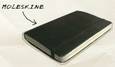
Moleskine—The PDA goes back to the future


Move over Palm Pilot and Pocket PC——the portable digital assistant for this season has gone retro and it's called the Moleskine (pronounced mol-a-skeen'-a). This little black book is the modern incarnation of the legendary notebook used by Van Gogh, Matisse, Breton, Picasso, Hemingway, Chatwin and now Conway.

Between its elegantly formed, hard black oilcloth covers rest 90 leaves, available blank, ruled or squared. Naturally, I chose the squared——why should order only be horizontal? There's also a neat expanding pocket in the rear, to house, I'm sure, the receipts from your favourite Parisian café. In it you'll find the history of the Moleskine, in French, German, Italian and (no doubt with some reluctance) English. There's a quality thread binding with bookmark, and a tasteful elastic closure to maintain discretion.

It's odd that something so quintessentially French should now be made in Italy, and predictably it comes at a premium——expect to pay about $22 Australian, £8 or $11 Stateside. But this is no mere notebook. It's an intimate connection with the creative current of history, a blank novel waiting to be written (just add words), a magnificent mythology. And as an entry ticket into the aspiring literati club, it would be cheap at thrice the price.

Most of all it's a beautiful anachronism, and the more I immerse myself in technology, the more I hanker for such things.

29 September 2004

Movie Review: Peter Sellers

I am usually the last one out of a movie theatre who isn’t being paid attendance money. Having a friend in the film-making business encourages me to pore over every word of the credits, savouring every funny name and future legend.

So it came as a surprise to see several groups still debating ‘Peter Sellers’ as I rose to my feet. They clearly were not discussing the merits of the film, as that, alas, would have been a fairly short topic of conversation. A little eavesdropping led me to the conclusion that they were instead discussing the accuracy of several aspects of the tale.

And let’s be clear, this is a tale, rather than a biographic film. It starts at the end of Sellers’ ‘Goon Show’ years, when I would really have like to see the background to how he came to be there, his relationships with Milligan, Seacombe et al. It then presents a theory of Sellers’ life which can be pretty well summarised in two sentences. I can just about picture it in my TV Guide now—“Peter Sellers was a flawed comic genius whose character was shaped by his domineering mother. He was therefore bereft of actual character, existing largely in a miasma of invented characters, both on and off screen, leading to a series of failed relationships, dependence on a charlatan psychic and his ultimate death from a dodgy ticker”.

Well, that’s a perfectly good theory, but it’s all a bit simple. One only has to look at Sellers’ improvisation in the Goons, Lolita or Strangelove to realise that he was a very rare sort of genius indeed, and I for one would rather have a wider picture of his life and come to my own conclusions, rather than have an interpretation of a man whom I have related to in film over many decades thrust upon me. In a sense this is a myopic biopic and manipulative to boot.

Sure, director Steve Hopkins tries to make the journey interesting. Reality and film sometimes blur into an attempt at stream of consciousness. Like a Sellers film, Geoffrey Rush moves in and out of Sellers various persona, and also those of key players in Sellers’ life. It’s a valiant attempt, but ultimately it’s all a bit to obvious and indelicate. To me, the artifice of a film should be like a skeleton—I want to know it’s there, but I’d rather not see it all the time.

What nearly saves this film is the performances. Geoffrey Rush is perfectly cast and shows real versatility, particularly in the excellent recreations of vignettes from Sellers’ films. He is ably supported by Emily Watson as first wife Anne, Sonia Aquino as Sophia Loren and Charlize Theron who is spot on as Britt Ekland and continues to grow in stature as an actress, as well as being pleasant to look at. John Lithgow overacts horribly as Blake Edwards, which makes him just about perfect from my recollection (what did Julie Andrews ever see in that man?) and Stephen Fry tries to play Oscar Wilde again, but in the wrong movie. Frankly the film would have been better (and shorter) without his character.

But even fine performances are not enough to make this a good film. It is ultimately too deliberate and too obviously manipulative for that. And the clever vignettes recreating actual Sellers’ films actually made me want to rush out of the theatre to borrow those Sellers originals rather than prolong the agony much longer. For a true Sellers fan this film will be disappointing, but one will have the satisfaction of the self-importance which comes through recognising many of the filmic references. For the person unfamiliar with Sellers’ work, it will hold no interest whatsoever. Whichever camp you are in, rush to your video store and demand a copy of Dr Strangelove. It will teach you much more about Sellers’ confused comic genius than any myopic biopic.